Nellie's Place
Brand Identity · Logo Design · Merchandise · Graphic Design
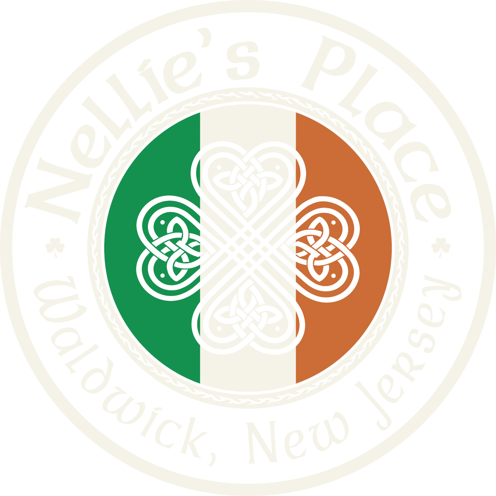
Nellie's Place originally came to me for merch.
Simple enough.
Except I quickly realized we had a problem: there wasn't really a brand to make merch from.
No official brand colors. No consistent typography. No proper logo system. When I asked about fonts, one of the owners told me they usually just pick whatever Gaelic-looking font feels right at the time.
No consistency, just vibes.
Which is a brand person's nightmare, but also a very fun place to start.
So I went back to them with a slightly bigger plan: before we make merch, let's actually give Nellie's a brand identity. Then we can make some really good merch.
And that's exactly what we did.
The fun part was that Nellie's already had a brand.
Just not in the traditional sense.
Nellie's has been in Waldwick, New Jersey for more than 35 years. You don't stick around that long without doing something right.
People know Nellie's for the thin-crust pizza, the Irish pub atmosphere and the fact that it just feels like Nellie's. They've built decades of recognition and loyalty without ever sitting down and deciding on official fonts or a color palette. Pretty cool.
So I wasn't interested in swooping in and turning a 35+ year-old neighborhood institution into some shiny new brand that nobody recognized.
The logo design and brand identity needed to feel like they had always belonged there.
I created a more cohesive visual system for the restaurant — logos, typography, colors and graphic elements that we could use consistently while still keeping the personality and history people already associated with Nellie's.
And then we got to the merch.
Having a real identity to work with completely changed what we could do. Instead of putting one logo on a shirt and calling it a day, I played with different elements of the brand and created merchandise that felt like something people would genuinely want to wear.
This one was also really personal.
I grew up going to Nellie's.
Actually, Nellie's was my first job. I was a host there when I was 16.
So getting asked years later to help create the visual identity for a place I grew up with was pretty surreal.
There's also something I love about the fact that Nellie's made it this far without formal branding. It's a testament to how good the actual restaurant is. The food, atmosphere and reputation did the heavy lifting for more than three decades.
I wasn't there to invent what Nellie's was.
I just gave everything that was already there a consistent way to look.
Brand elements


Primary Font
Dalelands Uncial
ABCDEFGHIJKLMNOPQRSTUVWXYZ
abcdefghijklmnopqrstuvwxyz
1234567890
Secondary Font
Open Sans
ABCDEFGHIJKLMNOPQRSTUVWXYZ
abcdefghijklmnopqrstuvwxyz
1234567890
Irish Green
#14914E
Burnt Orange
#CC6C36
Cream
#F5F3E8
Charcoal
#2B2B2B